
COLOR PAIRING MADE SIMPLE: ACCESSORIES THAT ALWAYS WORK

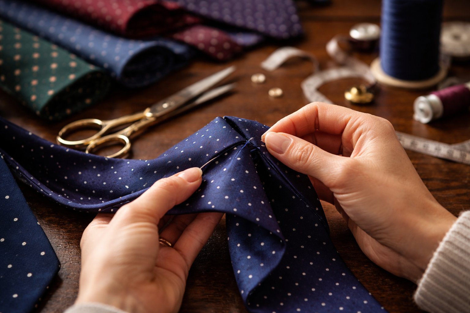
COLOR PAIRING MADE SIMPLE: ACCESSORIES THAT ALWAYS WORK
Some men chase trends; others prefer clarity. True elegance lives in the latter.
When your wardrobe is built on craftsmanship, fit, and quiet confidence, accessories become the final brushstroke ; the place where color, material, and intention meet. Yet even the most impeccably dressed man can pause when pairing hues.
This guide is for those who appreciate simplicity, precision, and cohesion. Consider it a compass for color pairing especially if your accessories, like ours, are crafted exclusively in silk. Silk has a way of catching light, shifting tone, and elevating even the subtlest palette, making the right combinations not just stylish, but intuitive.
Below is a curated approach to color pairing that always works and is refined, effortless, unmistakably elegant.
- Navy + Anything: The Master Key of Menswear
If there is a single color every man can depend on, it’s navy. It doesn’t compete, it collaborates with warm tones, cool tones, muted or vibrant. Navy provides balance.
Why it works: Navy is inherently neutral but carries depth. Silk enhances it further by adding a calm, luxurious sheen.
Try these combinations:
- Navy silk tie + white pocket square + silver cufflinks
- Navy silk tie + burgundy pocket square + brushed steel cufflinks
- Navy pocket square + charcoal tie + matte silver cufflinks
Shop the look:
- Product links
You can build an entire accessory wardrobe around navy and never run out of combinations.
- Burgundy & Ivory: Where Depth Meets Light
Some pairings feel like conversation while others feel like poetry. Burgundy and ivory belong to the latter. Burgundy brings richness, warmth, and authority. Ivory brings purity, air, and balance.
Why it works: This pairing blends vibrancy and softness, ideal for dinners, events, or moments that call for a quiet statement.
Ways to wear:
- Burgundy tie + ivory pocket square + gold-toned cufflinks
- Burgundy silk pocket square + charcoal tie (daytime refinement)
Shop the look:
- Product links
It’s a pairing that looks considered without looking calculated.
- Charcoal & Silver: Understated Power
When subtlety is the goal, charcoal steps forward. It’s sharper than black yet softer on the eye. Silver accents including cufflinks lift the palette with a modern touch.
Why it works:
Charcoal and silver share cool undertones, creating a clean, architectural combination. Silk elevates charcoal by giving it dimension and depth.
Try this trio:
- Charcoal silk tie + dove-grey pocket square + silver cufflinks
- Charcoal tie + white pocket square + polished metal cufflinks
Shop the look:
- Product links
Ideal for formal events, corporate meetings, and evenings that require elegance, not theatrics.
- Forest Green & Gold: Classic, Regal, Timeless
Green is often underused in men’s accessories, which is exactly why it stands out tastefully. Forest green, in particular, pairs beautifully with gold, creating a combination that feels refined and worldly.
Why it works:
Forest green carries earthy depth. Gold accents bring warmth and sophistication. Together, they feel bespoke.
Perfect pairings:
- Forest green silk tie + ivory pocket square + gold cufflinks
- Forest green pocket square + navy tie for a grounded, masculine palette
Shop the look:
- Product links
A man who wears this combination isn’t loud, he’s certain.
- Black & White: The Eternal Foundation
There are combinations that fade with seasons. Black and white isn’t one of them. It’s crisp, effortless, and universally flattering.
Why it works:
The contrast is clean, timeless, and grounded in tradition. In silk, black gains texture and depth while white remains luminous.
Classic combinations:
- Black tie + white pocket square + black enamel cufflinks
- Black tie + pearl-toned cufflinks for evening formality
Shop the look:
- Product links
When in doubt, this is the combination that never disappoints.
- Monochrome Neutrals: Elegance in Restraint
Some of the most sophisticated outfits use shades of the same color family. Neutrals-stone, sand, grey, chalk, etc can be layered without risk.
Why it works:
Monochrome palettes highlight texture and sheen. Silk shines subtly within a muted scheme, offering refinement without overt contrast.
Refined options:
- Grey tie + silver pocket square + brushed steel cufflinks
- Ivory tie + cream pocket square for daytime events
Shop the look:
- Product links
Perfect for minimalists or men who prefer quiet elegance.
- Midnight Blue & Champagne: Modern Evening Luxury
Midnight blue brings a modern twist to formal wear, offering richness without the starkness of black. Champagne which is soft, warm, and lustrous pairs beautifully with it.
Why it works:
The contrast is elegant yet gentle, ideal for evening occasions where silk can catch ambient light.
Effortless pairings:
- Midnight blue tie + champagne pocket square + gold cufflinks
- Midnight blue tie + soft ivory pocket square for formal dinners
Shop the look:
- Product link
This combination whispers luxury.
How to Pair Colors with Confidence (A Simple Framework)
Even with luxury accessories, pairing becomes simple when guided by a few timeless principles:
- Anchor with a Neutral
Navy, charcoal, and black create a base that supports bolder or softer tones effortlessly.
- Pair Warm with Warm, Cool with Cool
- Warm tones: burgundy, champagne, gold
- Cool tones: navy, silver, forest green
This keeps combinations harmonious.
- Let One Piece Lead
If the tie carries texture or strong color, keep the pocket square simple. If the square is patterned, choose a solid tie.
- Cufflinks Are the Bridge
Cufflinks should echo the overall temperature of the palette:
- Gold -> warm combinations
- Silver -> cool combinations
- Black enamel -> formal or minimalist looks
- Silk Changes Everything
Silk reflects light. Always consider how the shade appears under daylight vs. evening lighting.
Color Pairing Doesn’t Need to Be Complicated
When you choose silk accessories with intention and pair colors with clarity, style becomes instinctive. You don’t need a hundred combinations. You need a few that always work, crafted well, coordinated thoughtfully, and worn with confidence.
In the end, elegance is not about having more.
It’s about choosing better.

 Neckties
 Cufflinks
 Pocket Square
 Brooches